An Easy Win for Authors on Substack
Do this to increase your book sales.

Simple is good
Sometimes it’s the simplest of things that can make a huge difference…
My favourite thing about the live Geek Out Zooms is that there’s only ever a few of us online and so the conversation is very fluid.
In fact last time I think most people were too miserable about the US election result to even turn up, so Ann Richardson bagged herself a one-to-one with me. 👏
After a few attempts at trying to tease out what it is she ‘really’ wants from Type Club… (as she’s happy with her Subscriber growth and isn’t in it for the money, as she gives all proceeds to charity)… it turns out Ann still gets quite a buzz from selling the books she’s written, and would love to see them more widely read!
My reaction was:
“I didn’t realise you’d written any books!”
I’m just a casual observer over on
’s ‘The Granny Who Stands on her Head’ Substack. I have been aware of her head balancing antics for quite a while now, have read and enjoyed a few of her posts but hadn’t joined the dots on her having written several books!Well I never, you think you know someone! 😮
Well here’s an easy win for all you fellow authors, complete with a step-by-step guide for how to achieve it.
I’m sure this will garner some extra click throughs, which in turn will result in some extra sales.
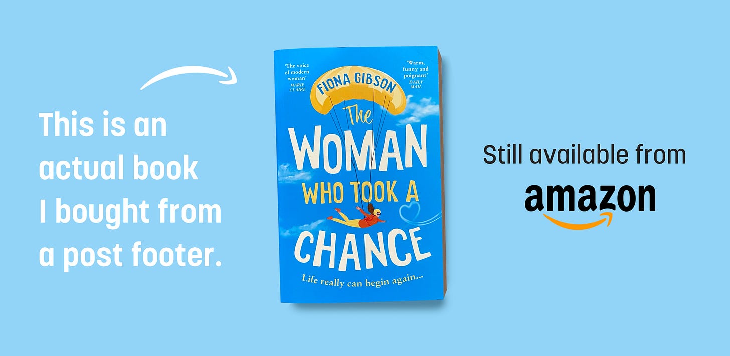
Why not introduce a graphic panel at the base of your posts that links directly to wherever it is that book is being sold?
The reason I am so sure of this, is that in my old agency days we used to use heat map software that would measure activity on a website.
Not just tell you which pages had the most views etc, but you could actually see mouse movements as people fumbled around trying to navigate what you thought was a perfectly fabulous design, until a few hapless punters turned out to be clicking in all the wrong places.
One thing that stands out amongst all of that analytical detail, was that if you give someone a mouse and put them anywhere near an image, they will try and click on it.
People love to click on images. Fact.
So if you want to move people along a certain digital path, give them some lovely things to click on and they’ll be skipping along your breadcrumb trail in no time.
People will often say “ but there’s a link to the book in the post” in their defence.
That’s all well and groovy, and text links work, but why not have the visual as well, it will increase the total number of click-throughs.
Particularly if the book jacket is doing its job and already helping the reader to like it!
Then when they click through they can delve into the detail of the book and often sample the first few pages!
It’s a modern miracle!
Five fab reasons to use a footer panel to sell your books:
They add a lovely ‘on brand’ visual to the end of your posts, and if they don’t you need a new cover designer.
Unlike the italicised intro para at the start of many posts begging for a subscription, which we have all trained ourselves to ignore by now, we don’t yet blindside graphic panels. Because Ads aren’t a thing here on Substack (yet), it will get noticed and looked at.
It’s a subtle way of letting everyone know you’re a published author without banging on it about it the whole time.
As and when your audience get so familiar with your book as the standard post footer, don’t you think they might greet it like an old friend should they ever see it in a real life bookshop and maybe offer to take it home?
Already include an image, but don’t link it to your book sales page?
Please go that extra mile, and you will no longer disappoint all those people who currently click on it hoping to be transported to the inside of your book… but instead are just served up a bigger version of the image. Sigh.
Convinced?
Here’s how:
Create a lovely image like the one above and import it into your post.
Select the image and click on the chain link icon from the toolbar (highlighted).
Paste in the url link of your book, wherever it is for sale online.
Test the link in the email before you deploy to make sure it’s going to the right place.
Want an image, but can’t create it yourself?
I’ll do it for you for just £25. 👏
All you need to provide is the following, which can be entered as you checkout:
Wording for banner Ad (200 characters maximum).
Url link to your book for sale.
Background colour reference (if you have a preference, otherwise I’ll pick one).
Just click through and checkout with this product and I’ll do the rest:
Or contact me via email or Substack DM if you’d like to discuss it further.
Perhaps you’ve written more than one book and would like a collection of banners.
That’s all for this week, see you in the Comments below! 😘
K8x
PS: Please ‘❤️’ below and Restack to help your fellow authors increase sales.


I love the description of the breadcrumb trail! Much nicer than talking about funnels which I'm pretty sure everyone is sick of 😅
great advice...thank you.