


Logo and branding unveiled
Logo and branding unveiled
Including the thinking behind it and workings out.

Welcome to my old world…
As I’m sure you’ve noticed by now, we have a shiny new logo and branding!
I thought you’d like to know how we arrived there, in all the painstaking detail.
No?
Just skip down to the bottom for the Call to Connect, where there is another chance to show off your Substack. 😉
For those of you still here, it’s a long one, you might want to read it in the App… and have a little lie-down halfway through.
Here we go!
The original thinking was to take the essence of the original Fight Club logo and modify it to make it legible at the tiny, tiny size of 256x256 pixels and then somehow add in a ‘substack’ for the wordmark without mis-using their logotype.
The logos on the bottom right panel (above) are where I’ve ended up, and the pink colour was selected to sit nicely with my other two Substacks ‘Off on a Tangent’ and ‘Co-Work Corner’.
As you can see from my desktop screen grab above, it was created in Adobe Illustrator (my old stomping ground), as I needed to convert the type to outline and ‘hand comp’ the ‘U’ and ‘B’ together as a hat tip to the original logo.
This also meant I could manually slant it 10.5 degrees (my favourite italic angle) and then easily replicate the same angle on the substack ‘corporal stripes icon’ to match.
The Logo
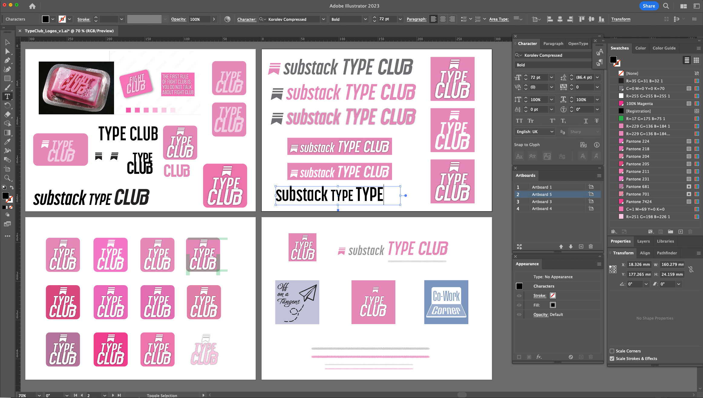
For the Publication logo (256x256 pixels) the name of the game is legibility, as it only appears very, very small as a thumbnail.
I opted for white lettering so it contrasts the most with the background pink, and added an outer black glow to give the edges extra definition.
I realise some of you will be finding its position in the box above deeply distressing, as do I, because it doesn’t look centred.
To explain, that’s because I felt the need to nudge it to the right more, to allow for the round corners once it’s been imported, as below.

It’s a compromise between the space to the corner edge of the ‘C’ matching that of the ‘B’, without the top of the ‘B’ being too close to the right hand edge.
Its position within the round cornered box feels balanced now.
Yep, this is the stuff that could keep me up at night! 😂
Those of you who were foolish enough last time around to ask for my input, are probably still trying to work out the exact dimension of a ‘tadge’, which I requested you to move something over by.
I’m nothing if not pedantic.
Always be prepared to make a few tweaks once you see your creations in situ, no more so than with...
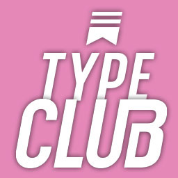
… the dreaded Wordmark
The Publication Wordmark needs to be 1344x256 pixels EXACTLY, which is a giant pain in the arse, given it doesn’t count white pixels as part of those dimensions, so you somehow have to design your way out of this nightmare situation!
This was a piece of cake with my first wordmark, as I could extend the aeroplane and its trail to fill the space.

But when you have text, it’s not so easy.
Like a lot of you, my first instinct was to put it in a box and be done with it.
Version 1
But I wasn’t a fan of this.
Putting it in a box always means the type size has to reduce to allow for the space margin around it, and it looks like a button.
Also if I put the ‘substack’ in any other colour than white, i.e. light pink or grey, it starts to get lost. Don’t even go there girlfriend!
And while we’re trying to make it a little less hideous should I try and match the corners to the round ones of the logo on the left? Dear god where will it all end?!
Version 2

I do prefer the grey and pink on a white background, but having to meet the exact requirement of 1344x256 pixels has resulted in an unwieldy baseline stagger.
Despite me spending a good 10 minutes bastardising the type to get the baseline of ‘substack’ to line-up with the base of the cross bar on the ‘T’, it still looks shit. Sigh.
Version 3

Ok, I’m greatly resisting the urge to say “and now with extra VIM” when introducing this one, because it does feel a bit like that, but do you know what?
Despite my initial misgivings as I approached this idea, I don’t not undislike the result.
Which, for me, as you’re beginning to realise, is high praise indeed! 🎉
Hang out the flags, let’s run with it!
We can always change it later if there’s a public outcry!
To the untrained eye, that underline may seem like, er well, an underline, but in fact it was created using Kyle’s Ulimate Pastel Palooza brushhead in Photoshop.
Who can resist a name like that, not me matey!
This underline ‘device’ also lends itself to be trotted out as handy page dividers:

It’s really worth taking the time to create some of these, as you will use them again and again, and they really help break up the blocks of type and therefore make it more approachable for the reader.
You increase the chances of your readers getting to the bottom of your articles if you allow them to stop off en route and have a bit of a breather.

Obviously you can use different colours and vary the depths and lengths, but never the latter within the same post.
I think we can all appreciate how uncomfortable this little chap below is making us feel now, when compared to those above.

The Welcome page logo
There is one place where the logo appears at a decent size to have some fun with, and that’s on the welcome page, which non-subscribers see when going into your Substack.
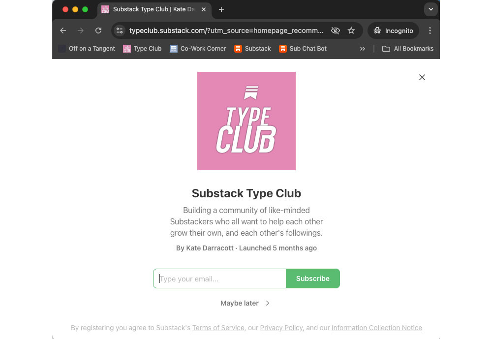
Wooo hooo, open the champagne, we have 600x600 pixels to play with here!
Bring back that tiny type that I told you not to include in the original logo, this is its chance to shine!
Give it some space to breathe, you’ll notice the top icon has moved away from the lettering, and the entire logo has more margin around it.
You can update this logo here:
Dashboard => Settings => Website => Welcome page => Welcome page photo
Email header
One last piece to the branding puzzle, and that’s the email header:

I realise you’re probably all reading this within the App, my dear Substackers, but most of your audience will be reading it in an email, so it’s worth creating a header.
You have 1100x220 pixels to run riot with, or maybe go into a creation frenzy with some seasonal ones bedecked with Autumn leaves or Christmas decorations.
To be honest, I wouldn’t even object to that, this is a good place to have some fun, but do put a reminder in your calendar to change them as their relevancy expires.
You can update the email Banner image here:
Dashboard => Settings => Emails => Email header & footer => Banner image
The Accent Colour
Nothing polarises people more than the highlight or accent colour.
There are two camps, the first who put it in the same colour as the rest of the branding, so it matches, in this case you would put it in the pink.

Then there are the digital marketers amongst us, who want to use it to lead people around our websites and entice them to click where we want them to click.
With the one exception of the ‘BIG RED BUTTON’ that clearly states ‘DON’T PUSH’, we humans are persuaded the most by the colour green.
We just can’t help ourselves, given a row of buttons, we are most likely to push the bright green one.
Which is why I will always use this colour as my ‘accent colour’, because it does exactly that, and highlights the path that I want you to follow.
Any guesses, as to what I might like you to do when you get to one of my homepages?
Yup. Subscribe.
The only time I wouldn’t use green is when one of the corporate colours is green, then I’d choose a contrasting, but not clashing colour like a bright pink or orange maybe.
You can adjust your highlight colour here:
Dashboard => Settings => Branding => Publication theme => Edit theme => Branding => Accent Color
This week’s Call to Connect:
Let’s see how you did with your brand designs and refreshes. Here’s an opportunity to subtly show us how banging your Substack is now looking:
Enter the Title of your Substack IN CAPS.
Enter a brief summary of what it’s about.
Describe your branding in no more than three words.
Enter your Subscriber number (so we can see any approaching a milestone and help you push it over).
Click through and take a look at those you like the sound of and ❤️ their Comment here so they can feel the love and rise to the top of this list.
As ever, the quicker you get your Substack into the Comments, the more people will see you and connect.
See you in the Comments! 😘
K8x
PS: Please ‘❤️’ below and Restack this post if you want to grow your Substack, as it will increase your visibility on Notes and help others find this post and join in the reciprocal boosting! 👏


1. Off on a Tangent
2. A humorous collection of Life Hacks, Reviews, Business Start-up Ideas, Observations and the occasional Rant, written by Kate Darracott, a midlife entrepreneurial empty-nester on a Gap Year.
3. Beautifully Sidetrackable
4. Subscribers: 1,113
1. NUMBER 2 PENCIL
2. A teenager jotting down thoughts with a #2 pencil in an effort to figure out life. (And then, ya know, typing them out on a computer)
3. Calming, Clean, Fun
4. Subs: 158