It starts with a logo…
My intention with this Substack is to build it with you, so you can play along and add whatever features I’m talking about to your Substack, if you haven’t already, or perhaps refine them if they already exist.
The eagle-eyed amongst you will have noticed a glaring lack of logo and any kind of branding on the Substack Type Club so far, and you’d be right!
Good ol’ Arial Bold is providing the title visual, and we have no colours yet.
Why launch without these?
I would say it was my cunning plan all along to launch without a logo just so we could go through the creation process together, but that wasn’t the real reason.
I was using the lack of logo as a procrastination tool:
“I can’t possibly launch yet, because I haven’t even generated the logo!”
Sound familiar?
Having been in the design and digital marketing business for my entire working life, the thought of ‘going live’ without so much as a logo seemed ludicrous!
This was a top notch excuse to faff around for a bit longer!
In fact excuses for delay don’t really come better than this, particularly as this Substack is supposed to know what it’s doing in terms of presentation.
Then I leant heavily on my newly acquired mantra:
Done is better than perfect.
These five words will help you press that ‘publish’ button when you’re not 100% happy with a piece… you can always edit it later.
It will help you get your Substack out of the starting blocks!
It will help clear the ‘so called’ obstacles in your way, and just get on with it.
This is digital, it is not print, I’m not stuck with Arial Bold for all eternity and neither will you be, we can shape and mould and change and tweak for the rest of time, but we can’t change anything if there’s nothing there in the first place.
What happened?
I’m sure it will come as a shock to you, that when I launched this Substack without any branding, the world didn’t fall in, the style police didn’t bang down my door and arrest me, and literally no one mentioned it.
So if you’re using that as an excuse not to start, you’re going to have to think of another one. 😉
So let’s address that pesky white space and clunky title now, together.
Why bother with branding at all?
If I asked you “what’s the point of a logo?” most of you would say “recognition”, and you would be correct in that, but that’s not the only reason.
Here’s something I find fascinating… each time someone sees your logo they will ‘like’ you more.
Really?
Like you more?
Not just recognise you more?
Yup. That’s right.
Here’s the science bit…
In the 1960’s Robert Zajonc conducted a series of experiments which led to the development of the ‘Mere-exposure effect’.
I first stumbled upon this theory in a book where there was a grid of about 6x9 Chinese symbols and it asked me to study them for a minute.
Then over the page, there was a similar grid of Chinese symbols and it asked me to choose the three I liked the best.
I don’t speak Chinese so had no clue what any of them meant, but chose three anyway, and it turns out that those three had also appeared on the previous page!
People are most likely to choose ones that they have seen before, than the new/unfamiliar ones.
Genius!
You can change someone’s opinion about something just by the frequency with which they see it!
Go on… test this theory… go to your Substack Chat section and have a scroll down the logos and icons, notice how you feel about ones you recognise, versus ones that are unfamiliar to you.
This phenomena also explains why sometimes there is an ‘outcry’ when a company changes its branding.
True fans of the brand scramble to justify why they ‘hate’ the new logo.
They don’t really, they just genuinely miss the old one, like an old friend.
Nostalgia also brings good feelings, for instance when you are reminded of an old chocolate bar by looking at it’s dated logo and packaging.
Even if it wasn’t a particular favourite of yours at the time, your brain just by recognising it, will attribute affection to it.
Logo design
On Substack we have two opportunities to make our mark visually, the Publication logo (256x256 pixels) and the Publication wordmark (1344x256 pixels).
When designing the logo, try and use the maximum amount of space allowed. Clarity is key, try not to put too much tiny detail in, it just gets lost.
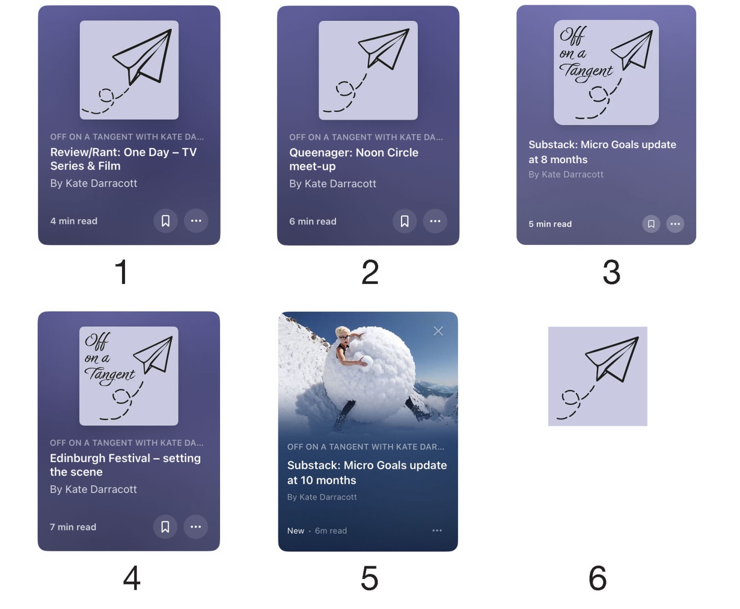
Substack does keep changing how it uses the logo, so keep a close eye and change it to suit the latest use case. For example, using my other Substack’s logo for Off on a Tangent, here’s how the App home screen icons have changed, just in the 10 months that I’ve been here.
Original logo.
I felt the paper airplane was a bit too bold and clunky for this use, so reduced it and made it more airy.
Substack started not including the name of our Substacks on these thumbnails (see below the logo compared to the others), so I added it into the logo.
Surely you want the name of your Substack to appear???Ah yes, they then realised the error and put it back in.
Then they ditched the logos completely and changed it to the lead image, with colour way to match the image, not your branding.
I then updated the logo to a cross between 1 and 2, as it will only be viewed in a tiny size from this point.
Until they change it again.
Once you have nailed your logo and wordmark you can generate some fun text dividers and the email header (below), to give your Substack the full set.
What colour?
Go with a colour you like and which reflects the brand.
Imagine it on business cards, t-shirts, stickers, bags… do you still like it?
I decided to go for a purple for Off on a Tangent because I love purple and this one has a hidden joke inside.
The official Pantone colour reference is ‘Very Peri’ (in their case, short for periwinkle blue), but as a midlife woman I found it very much resonated with me for an entirely different reason! 😉
Upon discovering it’s name, I was 100% set on it.
When choosing a colour, make sure to reference the Pantone chart as you will then be able to communicate that colour to any printer or designer.
Going with something that looks ‘ok’ on your screen or home printer is very difficult to replicate and may well lead to mismatching in a print situation, so stick with a Pantone reference or Hex Colour Code, which makes the colour ‘portable’ across many platforms and mediums.
Branding challenge
My challenge for you this week is to look at your branding, whether it’s a case of creating a logo from scratch, like me, for Substack Type Club, or just looking at what you already have in context and then maybe tweaking it.
This is digital, unless you’re sitting on a stack of branded t-shirts it’s all a moveable feast so tweak away until you’re 100% satisfied with it.
Fun market research
A fun test of memorability to do with your shiny new logo is to position it in a grid of 9 other logos (3x3, not top left or middle), ask anyone who will give you the time to study them for 30 seconds and then ask them to describe the ones they can remember.
Obviously don’t use well known logos like MacDonalds or Starbucks for the other eight. 😉
If yours is not amongst the ones they can describe from memory, then go back to the drawing board.
A two week deadline
I will be working on the branding for Substack Type Club over the next two weeks, and then will do either the ‘big reveal’ or a poll where you can decide which one you prefer out of a few possibles.
Take this time to check in with your own branding and we can compare results then.
I will show you the development journey, so you can apply some of the rules to your own Substack’s branding as you deem necessary.
This week’s Call to Connect:
Let’s talk about colours and branding. If you have already settled on your logo and branding, please share the thinking behind it with us, so we can get a feel for how it’s done:
Enter the Title of your Substack IN CAPS.
Enter a brief summary of your branding.
What colour/s have you chosen and why?
Enter your Subscriber number, so we can see how established it is.
Are you happy with it, or would you like some feedback?
Have a look up and down the Comments to see how others were inspired, or need help to develop their logo with a second opinion.
Click through and take a look at those you like the sound of and ❤️ their Comment here, so they will rise to the top of this list.
As ever, the quicker you get your Substack into the Comments, the more people will see you and connect.
See you in the Comments! 😘
K8x
PS: Please ‘❤️’ below and Restack this post if you want to grow your Substack, as it will increase your visibility on Notes and help others find this post and join in the reciprocal boosting! 👏


1. OFF ON A TANGENT with Kate Darracott
2. As this Substack is very whimsical and entertaining, I decided to go for the paper airplane motif as it’s something you might construct to entertain yourself, when you’re supposed to be doing something else, with that blank sheet of paper. The typeface is also an elaborate script that exudes ‘I have time to kill and lavish on these three words’ rather than any kind of efficient, businesslike typeface.
3. The colour is Pantone’s VERY PERI. I love purple and was sold on this particular shade, as in my head, it’s short for peri-menopausal which I can very much relate to!
4. Subscribers: 1,037
5. I love it!
1. UNTANGLED WHISPERS with Kym Swan
2. My logo is one is made for my photography business and is a basic image of a Swan in my colours. My photography goes under the banner of Swan Pro Pics. I currently have no wording on it.
3. Colour is a bright but deep orange. I just feel like it is an energising colour and represents me now. I have no idea about Pantone colour. I like to think it represents who I am as a person.
4. Less than 20.
5. I love it and think it is recognisable BUT I think popping my Title on it would help. I am also a bit unsure of keeping it as it doesn't feel like it sits with the name Untangled Whispers, which to me is more blues and purples and etheric. So still ruminating on this! I could just change the logo colour I guess, but while the Swan IS me it doesn't feel it fits the name of the Substack...
Thanks for an interesting read and giving me things to ponder upon.